Posters/Ads

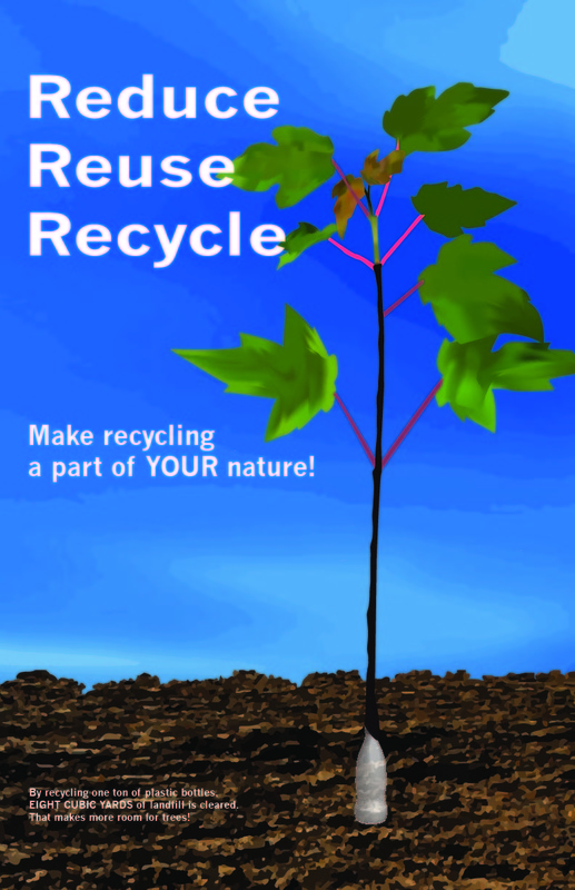

All of these were created for a class and the concepts used were specifically chosen to draw attention in specific ways. The book cover uses complimentary colors to draw attention to the boy in the foreground and the rocket in the distance. By keeping the bottom of the Reduce. Reuse, Recycle image filled with dirt at the bottom, it keeps the image balanced and draws attention to the statistics that are written in white on the page. By keeping the abuse poster off to the left third of the page, I kept it out of the "dead zone" in the center of the page that makes so many poster boring and easy to lose interest.
